Brand System·Public Guidelines·Singapore
Brand Guidelines
The official source of truth for On The Ground's visual identity. Use these guidelines to represent the brand consistently across all platforms and materials.
Logo·Construction
The Wordmark
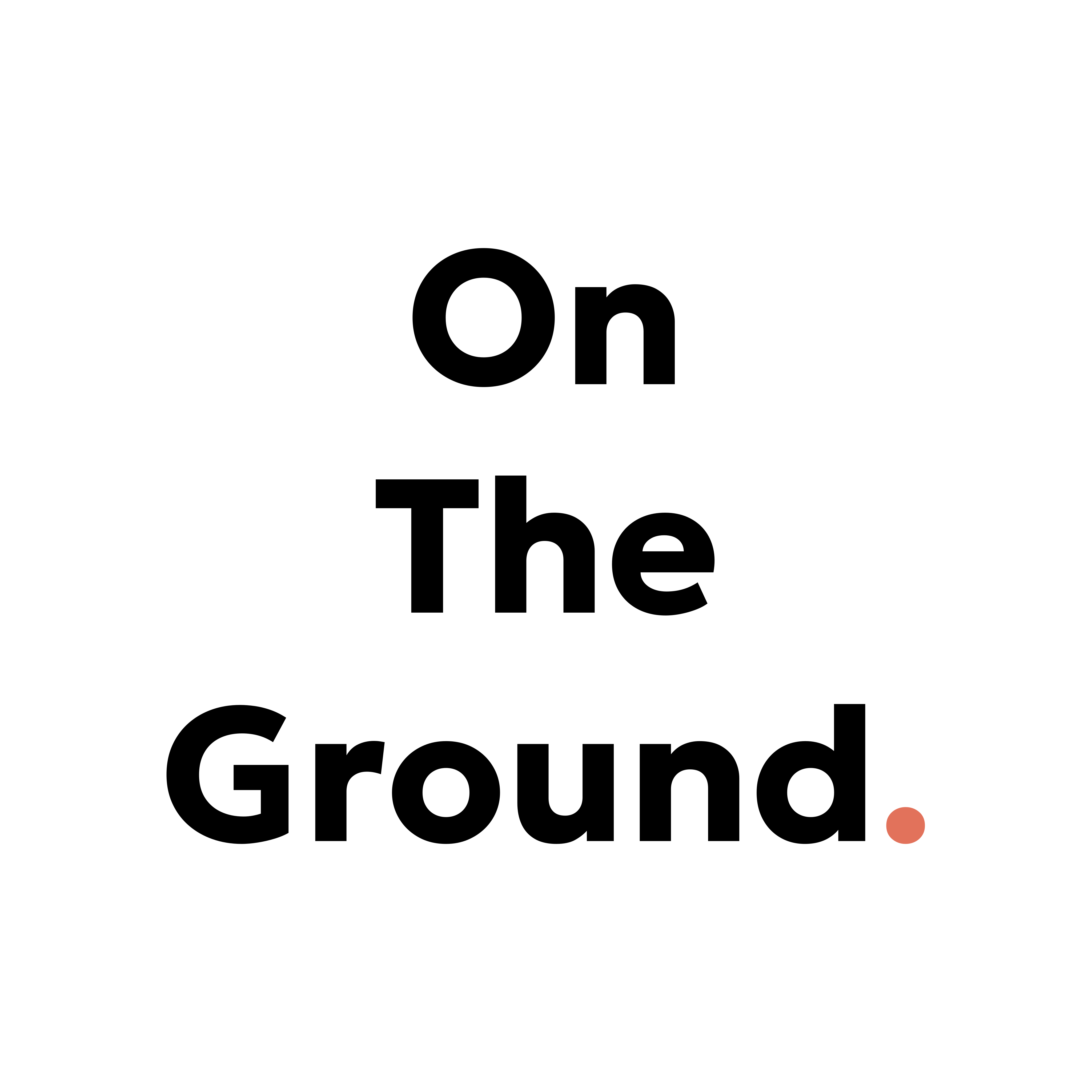
The logo is a fixed three-line stack reading On / The / Ground. in Geologica Bold, set as vector outlines. The full stop (period) is a single terracotta mark. The letterforms and spacing are locked — the logo must never be reordered, squashed, stretched, or arranged on a single line.

Typeface
Geologica Bold (variable font, vector outlines locked in SVG). Do not set page text or UI in Geologica—Inter is the only typeface for all body, UI, and heading text on the site.
Structure
Three horizontal lines: On · The · Ground. — each aligned left. The full stop is a single rounded square (terracotta). Tracking and line height are fixed in the master SVG.
Colour (Primary)
Wordmark: #000000 (black ink on light backgrounds)
Full Stop (Period): #E2725B (terracotta — reserved only for the full stop)
Logo·Circular Lockup
For Circle-Only Platforms
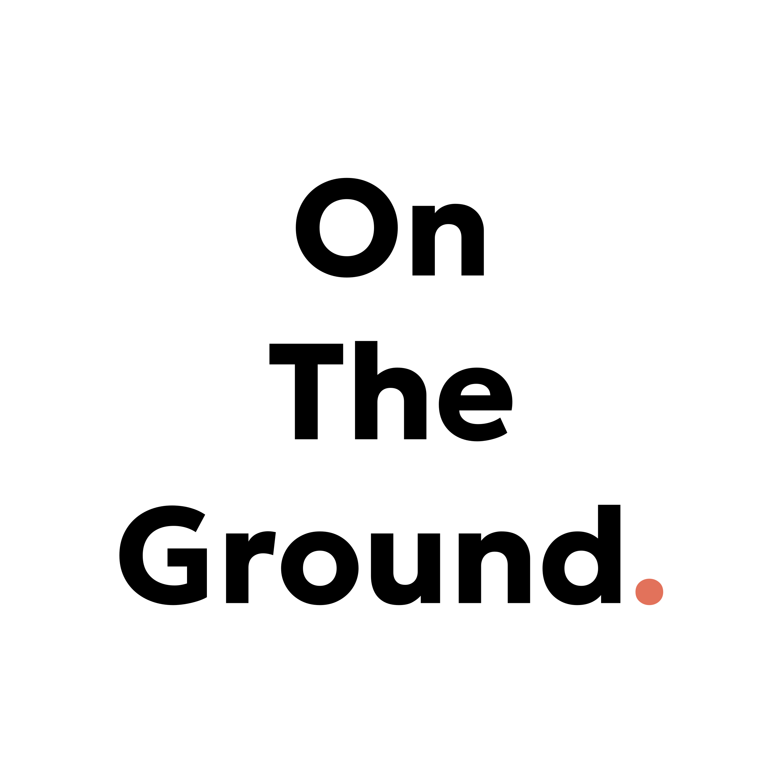
Where the primary lockup would be cropped (Instagram profile photos, LinkedIn profile pictures, Slack workspace icons), use the circular-safe version. All three lines are centred, with The positioned at the exact vertical centre of the circle. The full stop remains terracotta.
Layout·Clear Space
Breathing Room
The logo must never be crowded. Maintain a minimum clear space of 1X on all sides, where X equals the height of one line of text. Where possible, provide 1.5X to 2X clear space for a stronger presence.
Clear space rule (1X minimum; 1.5–2X recommended)
Pro tip: On web, clear space is handled naturally with margin/padding. In print or social media crops, double-check that the logo has breathing room and isn't touching text, edges, or other elements.
Scale·Minimum Size
Size Boundaries
Never reproduce the logo smaller than 110px in digital or 20mm in print. Below these thresholds, letterforms lose definition and the full stop becomes difficult to resolve. For very small applications (app icons, favicons), switch to a simplified mark instead.
Too Small
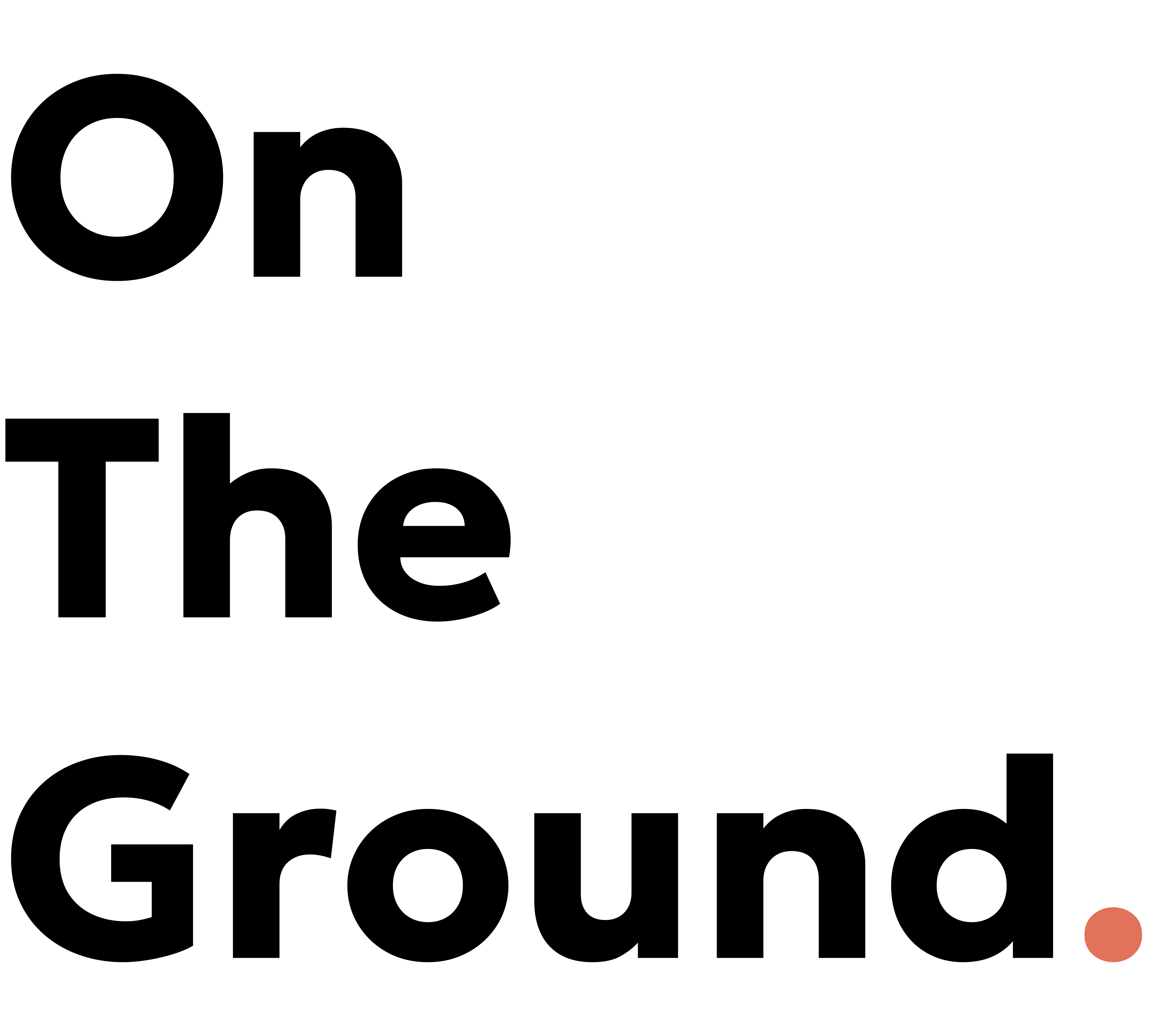
<110px: letterforms muddy
Minimum
110px: crisp and clear
Recommended
180px+: preferred size
Visual·Colour
Colour Values
The wordmark is always pure black or reversed to white on dark backgrounds. The full stop is always terracotta. Terracotta is reserved exclusively for the full stop — never use it elsewhere in the wordmark, never recolour the dot, and never tint it even in reversed versions.
Wordmark (Primary)
Pure black ink on light and white backgrounds.
Hex: #000000
RGB: 0, 0, 0
Wordmark (Reversed)
Pure white on dark backgrounds or dark colours.
Hex: #FFFFFF
RGB: 255, 255, 255
Full Stop (Period)
Terracotta — reserved only for the full stop. Never recolour, never use elsewhere.
Hex: #E2725B
RGB: 226, 114, 91
For Print: Provide your printer with the hex value. They will match it to Pantone via their own bridge tables. Never guess a Pantone number — hex is the source of truth.
Reversed·On Dark
Logo on Dark Backgrounds
The wordmark reverses to white. The full stop remains terracotta — it does not reverse, and its colour is preserved for contrast and brand recognition.
Usage·Do & Don't
Correct and Incorrect Usage
✓ Correct
Full colour, black and terracotta
Primary lockup with proper spacing and colours. Use this everywhere.
Reversed on dark
White wordmark with terracotta full stop. The dot never changes colour.
Circular-safe version
For profile photos and circle-only platforms. All lines centred, "The" at vertical centre.
✗ Incorrect
Reordered or on single line
The three-line stack is locked. Never rearrange, squeeze onto one line, or change the order.
Stretched or compressed
Never distort the logo. Always scale proportionally from the master SVG.
Recoloured full stop
The terracotta dot is fixed. Never change its colour, even for thematic variations.
Low contrast on busy background
Always maintain sufficient contrast. Never place on patterns, photography, or busy textures without a solid backing.
Added effects or shadows
No gradients, glows, bevels, or drop shadows. Use the logo as-is from the master files.
Brand·Rationale
Why Terracotta, Why on the Full Stop
The terracotta colour represents clay, brick, and soil—the literal ground. It sits exclusively on the full stop (period) because that punctuation mark symbolises a decision: a definitive end, a boundary drawn, a scope fixed. On The Ground's methodology is rooted in fixed-scope, one-week sprints that ship working software—not endless iterations or feature creep. The terracotta full stop is a visual anchor for that principle.
The colour is never used elsewhere in the wordmark, never tinted or recoloured even when the text reverses to white. This exclusivity reinforces its meaning and ensures the logo remains distinctive and instantly recognisable.
Downloads·Assets
Download Brand Assets
Primary Lockup
Three-line stack. SVG format (scalable).
Circular Lockup
Profile-picture safe. SVG format.
SVG is preferred. Vector format scales to any size without quality loss. Use these files directly in digital applications.
For other formats or colour variants, please contact design@ontheground.agency.